Looking for a Tutor Near You?

Post Learning Requirement » x
Ask a Question
x

Choose Country Code

x

Direction

x

Ask a Question

x

Hire a Tutor

Notes On Colour Study

Published in: Art
487 Views

Notes For Colour Study

Juane O / Kuala Lumpur

8 years of teaching experience

Qualification: diploma in illustration

Teaches: Drawing, Art, Painting

Contact this Tutor
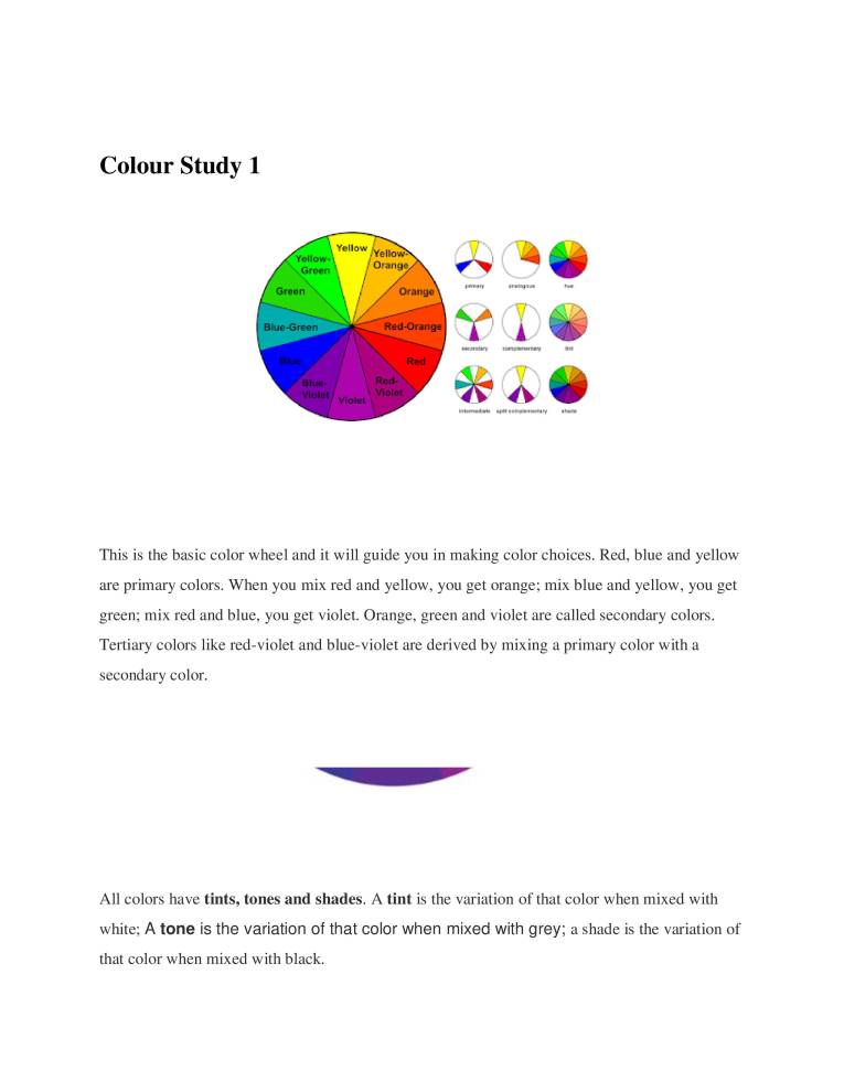
  1. Colour Study 1 Yellow Yellow. Groon Green Blue-Green Violet ellow Orange Red-Orange Red Red- Violet Violet This is the basic color wheel and it will guide you in making color choices. Red, blue and yellow are primary colors. When you mix red and yellow, you get orange; mix blue and yellow, you get green; mix red and blue, you get violet. Orange, green and violet are called secondary colors. Tertiary colors like red-violet and blue-violet are derived by mixing a primary color with a secondary color. All colors have tints, tones and shades. A tint is the variation of that color when mixed with white; A tone is the variation of that color when mixed with grey; a shade is the variation of that color when mixed with black.
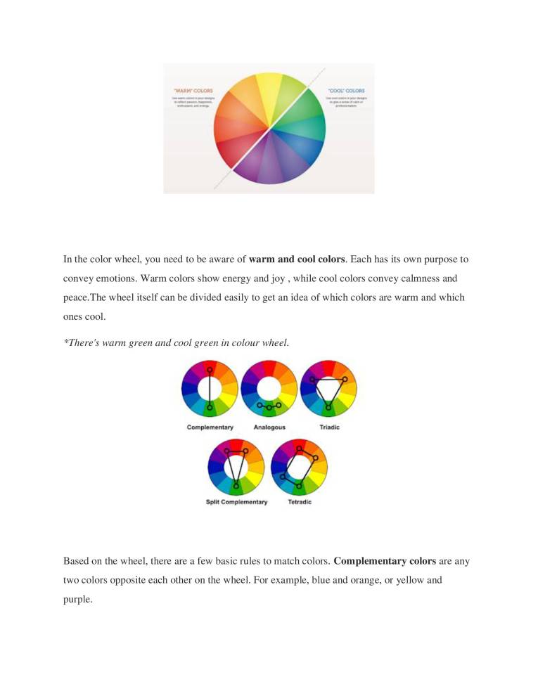
  2. •WAR M• cocoas •cooe cotog-s In the color wheel, you need to be aware of warm and cool colors. Each has its own purpose to convey emotions. Warm colors show energy and joy , while cool colors convey calmness and peace. The wheel itself can be divided easily to get an idea of which colors are warm and which ones cool. *There's warm green and cool green in colour wheel. ccc Complementary Analogous Triadic Split Complementary Tetradic Based on the wheel, there are a few basic rules to match colors. Complementary colors are any two colors opposite each other on the wheel. For example, blue and orange, or yellow and purple.
  3. These create a high contrast, so use them when you want something to stand out. Some easy experiments can be shown for your better understanding. Complementary Colour Experiments - YouTube https://www.youtube.com/watch?v=ys1xMMfPmqM Split complementary colors use three colors. The scheme takes one color and matches it with the two colors adjacent to its complementary color. For example, blue, yellow-orange and red- orange. Analogous colors are any three or four colors next to each other on the wheel. For example, orange, yellow-orange, and yellow. With analogous colors, it's best to avoid hues as they can be jarring. Instead, focus on tints of analogous colors. Triadic colors are any three colors that are equally apart on the color wheel. For example, red, yellow and blue . The Triadic scheme is also high-contrast, but more balanced than complementary colors. The trick here is to let one color dominate and accent with the other two. Tetradic or double complementary colors uses four colors together, in the form of two sets of complementary colors. For example, blue and orange is paired with yellow and violet. This is the hardest scheme to balance, Blacks and whites are used for "monochromatic color schemes. Monotone chromatic is just one single hue and its variations in terms of tints, shades and saturation. Using saturation and tint/shade variations of
  4. a color is always good. However, using a fully monochromatic scheme has a risk of monotony. Using it with pure white or black can be efficient, though. Monotone achromatic is a special instance of the monotone scheme which consists of only neutral colors ranging from black to white. A scheme like this can be efficient, but it can very easily look boring. Using an achromatic scheme with just one bright color for highlight can be very effective. 25/7/2019